Introduction to Web Component
What's web component?
Web components are a set of web platform APIs that allow you to create new custom, reusable, encapsulated HTML tags to use in web pages and web apps.
-- webcomponents.org --
For example:
<script type="module" src="node_modules/@spectrum-web-components/switch/sp-switch.js"></script>

---

<sp-switch emphasized value="on" checked>
  Switch Web Component
</sp-switch>
source: spectrum - switch componet
Web Component Spesifications
There are four key specifications that define web components and enable their use in building web applications:
1. Custom Elements
2. Shadow DOM
3. ES Modules
4. HTML Templates
1. Custom Elements
It is a set of API spesification in the browser to create custom tag html.
class BeautifulButton extends HTMLElement {...}

window.customElements.define("beautiful-button", BeautifulButton);

---

<beautiful-button></beautiful-button>
source: web.dev - Custom Elements
2. Shadow DOM
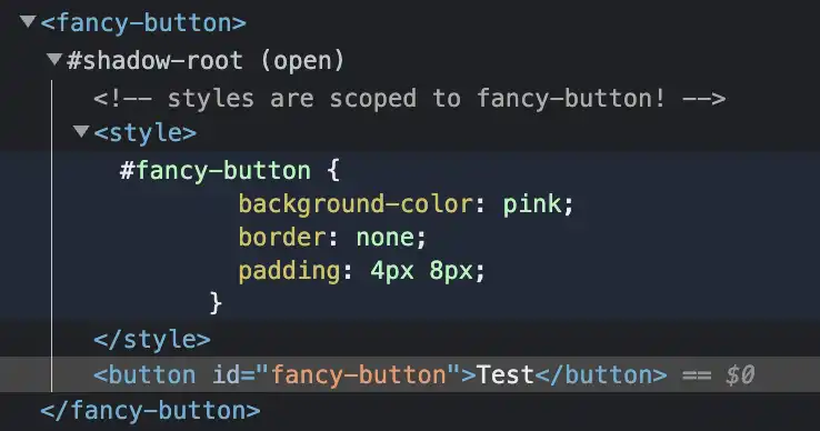
The Shadow DOM is a web platform feature that provides encapsulation for web components. It allows you to create a separate DOM tree and style tree that are attached to a host element, and that are isolated from the main document's DOM and style sheets.
It helps to prevent conflicts with the main document's styles and layout.
How to create Shadow DOM (Element.attachShadow)
class FancyButton extends HTMLElement {
  constructor() {
    super();

    const shadowRoot = this.attachShadow({ mode: 'open' });
    shadowRoot.innerHTML = `
      <!-- styles are scoped to fancy-button! -->
      <style>#fancy-button { ... }</style>
      <button id="fancy-button">...</button>
    `;
  }
};
source: web.dev - Shadow DOM
Example of Shadow DOM

3. ES Modules
ES Modules enable web components to be developed in a modular way that is in alignment with other industry accepted implementations for JavaScript application development.
<script type="module" src="awesome-explosion.js"></script>

...

<script type="module">
  import 'awesome-explosion.js';
  ...
  import {awesomeExplosion} from '@awesome-things/awesome-explosion';
</script>
source: HTML Living Standard - ES Module
4. HTML Templates
Defines how to declare fragments of markup that go unused at page load, but can be instantiated later on at runtime, that can be cloned and inserted in the document by script
Content between <template></template> tags
- Will not render until it is activated
- Has no effect on other parts of the page - scripts won’t run, images won’t load, audio won’t play - until activated
- Will not appear in the DOM
Example usage of Template Elements
Declare a template:
<template id="mytemplate">
  <img src="" alt="great image">
  <div class="comment"></div>
</template>
Use the template:
var t = document.querySelector('#mytemplate');
// Populate the src at runtime.
t.content.querySelector('img').src = 'logo.png';

var clone = document.importNode(t.content, true);
document.body.appendChild(clone);
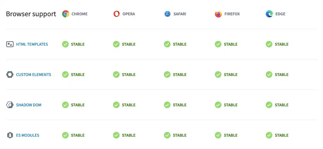
Browser Support

Use Polyfills
npm install @webcomponents/webcomponentsjs
// load webcomponents bundle, which includes all the necessary polyfills
<script src="node_modules/@webcomponents/webcomponentsjs/webcomponents-bundle.js"></script>

// load the element
<script type="module" src="my-element.js"></script>

// use the element
<my-element></my-element>
For more detail: webcomponents.org/polyfills
Let's Demonstrate!
We will try to create our arcade button component using web component with property 2 variant only:
purchasing: #EF6000
non-purchasing: #307FE2
The Code
const color = {
  purchasing: '#EF6000',
  'non-purchasing': '#307FE2',
}

class ArcadeButton extends HTMLElement {
  constructor() {
    super();

    // render the element
    const shadowRoot = this.attachShadow({ mode: 'closed' });
    shadowRoot.innerHTML = `
      <!-- styles are scoped to arcade-button! -->
      <style>
        :host([variant='purchasing']) #arcade-button {
          background-color: ${color.purchasing};
        }
        :host([variant='non-purchasing']) #arcade-button {
          background-color: ${color['non-purchasing']};
        }
        #arcade-button {
          border: none;
          padding: 4px 8px;
          font-size: 18px;
          color: white;
          padding: 8px 20px;
          border-radius: 8px;
        }
      </style>
      <button id="arcade-button">
        <slot></slot>
      </button>
    `;
  }
};

window.customElements.define('arcade-button', ArcadeButton);
The Result
<arcade-button variant="purchasing">Purchasing Variant</arcade-button>
<arcade-button variant="non-purchasing">Non-Purchasing Variant</arcade-button>